hoka brand catalog
CREATIVE DIRECTION / ART DIRECTION / DESIGN
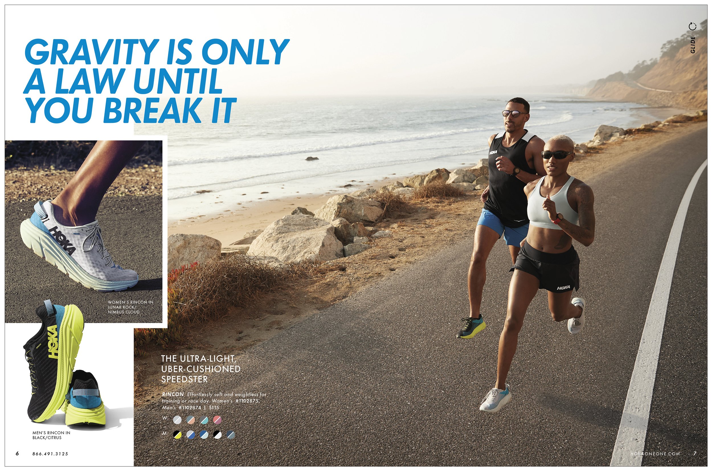
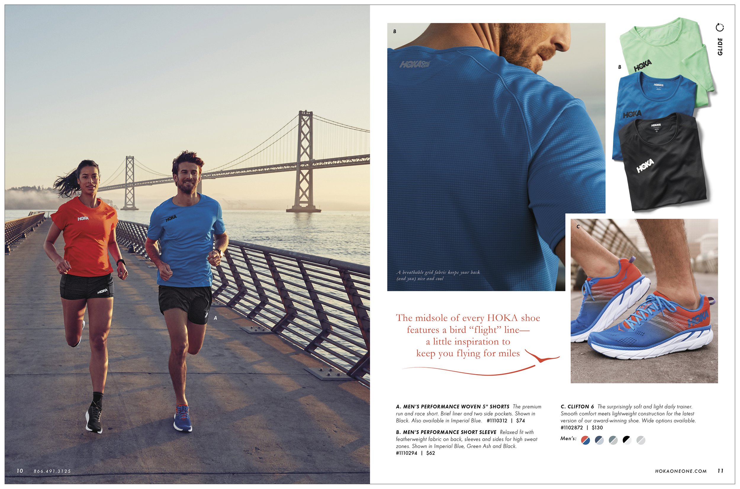
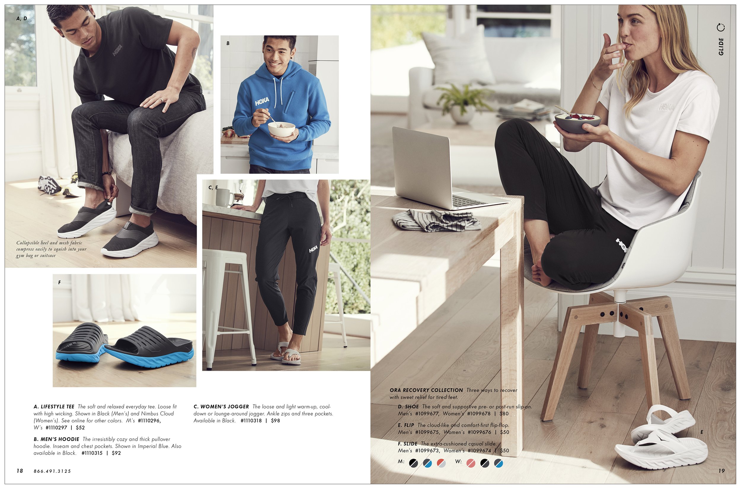
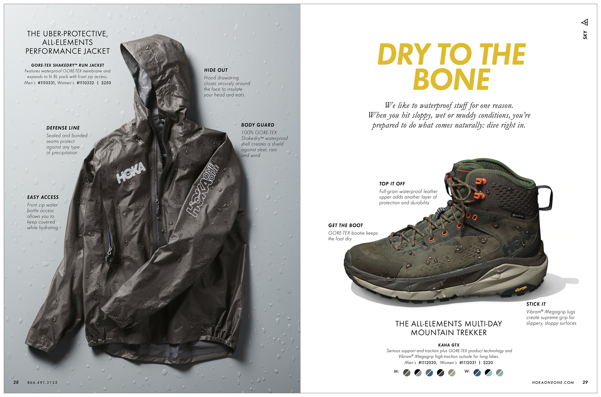
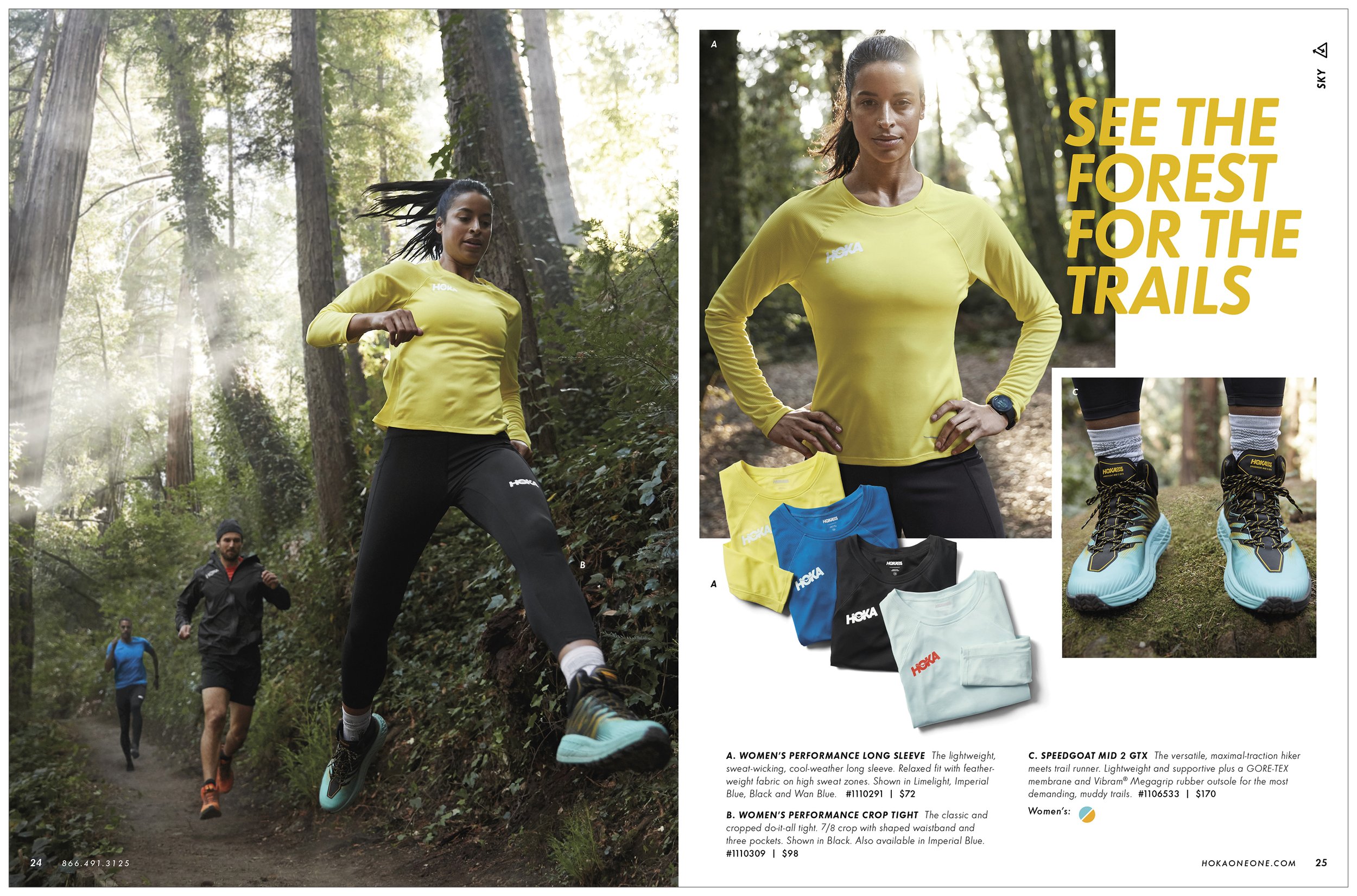
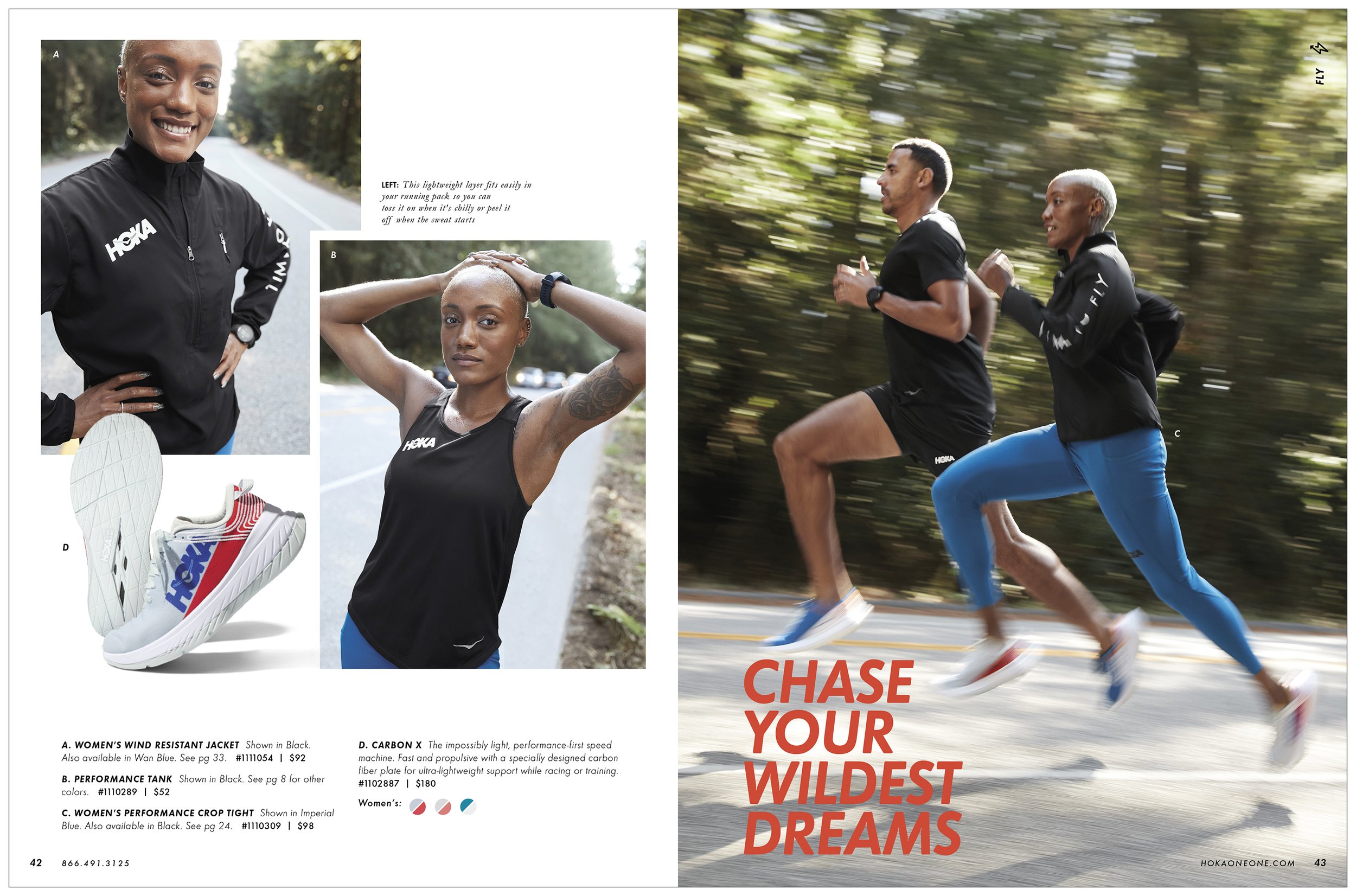
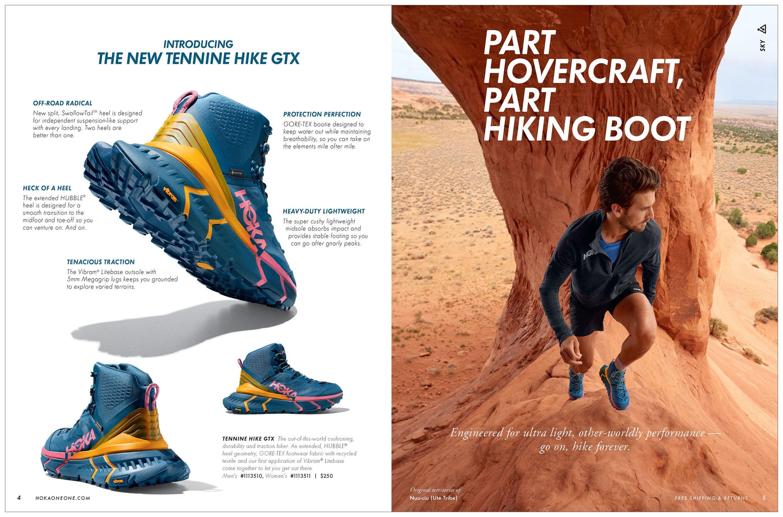
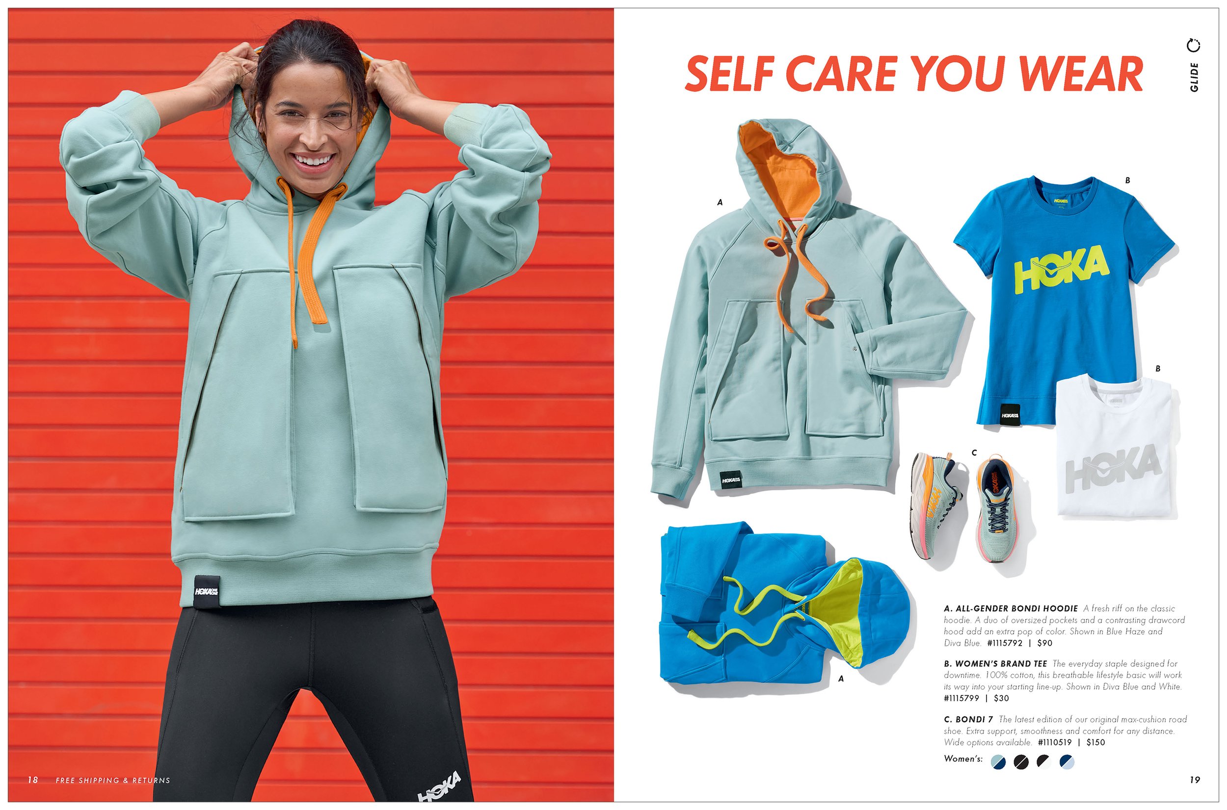
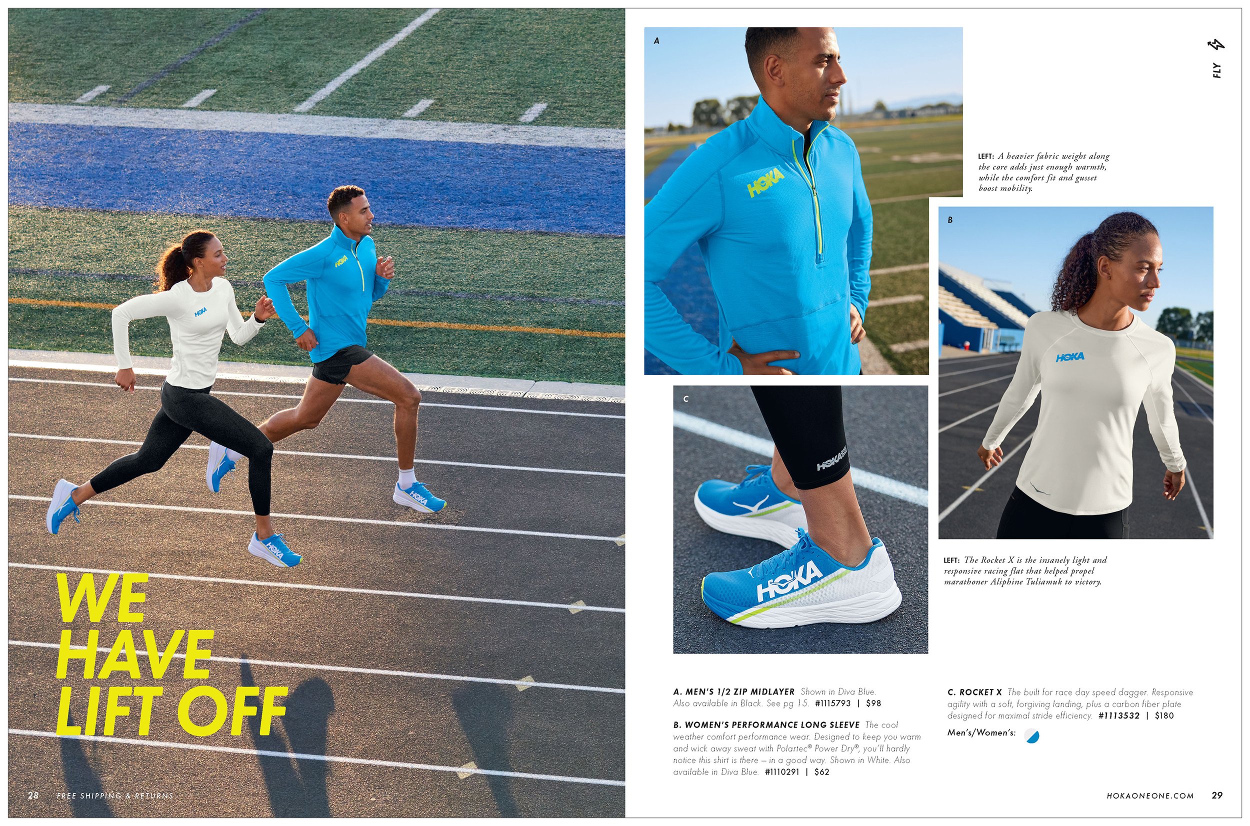
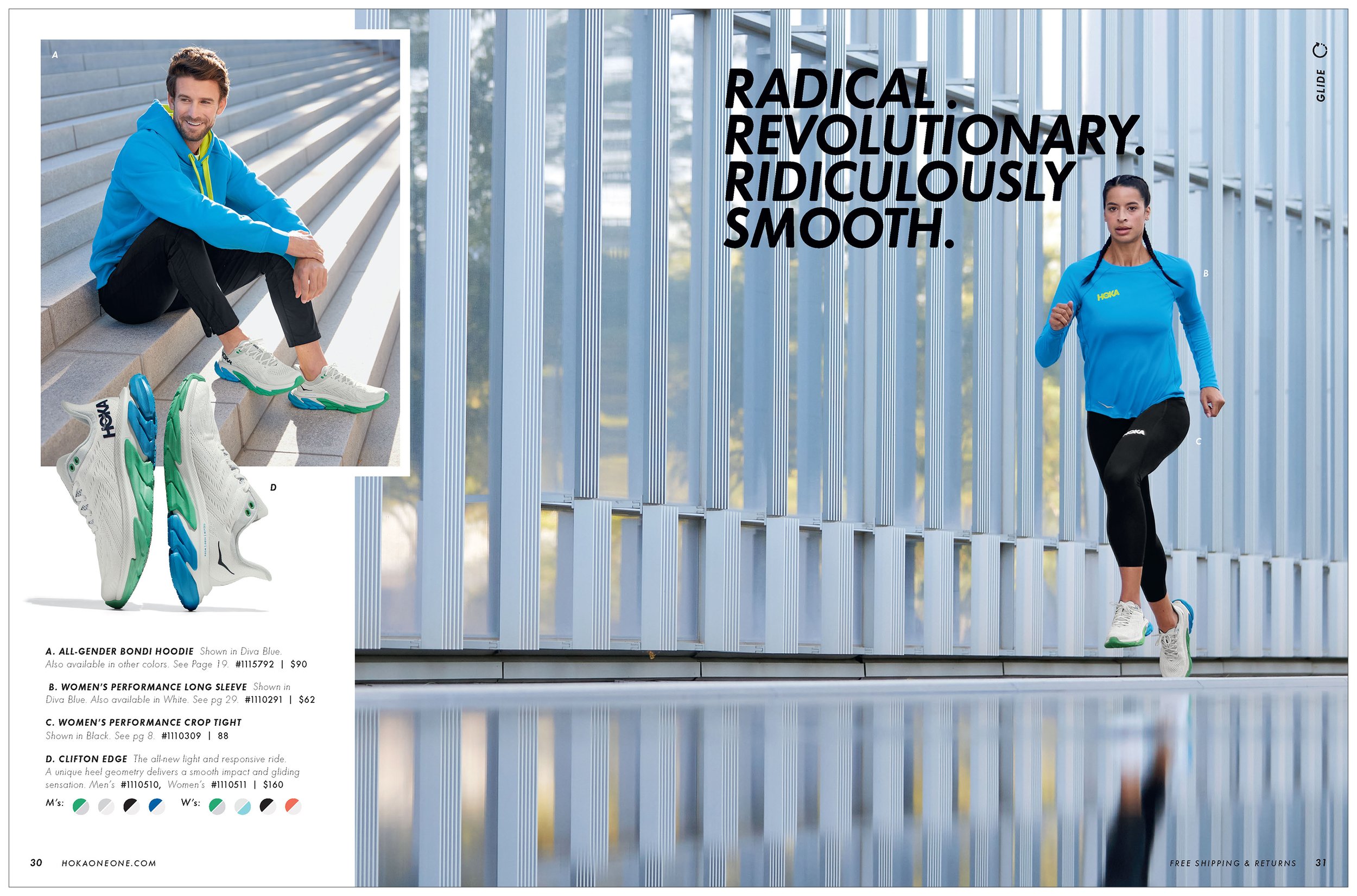
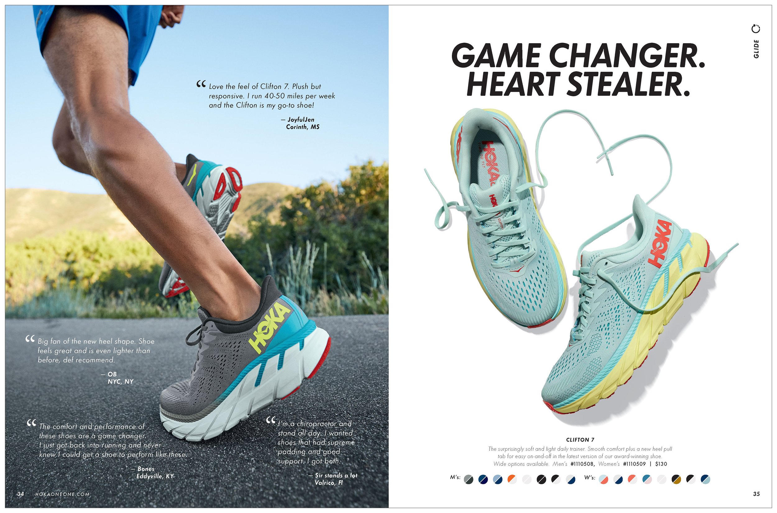
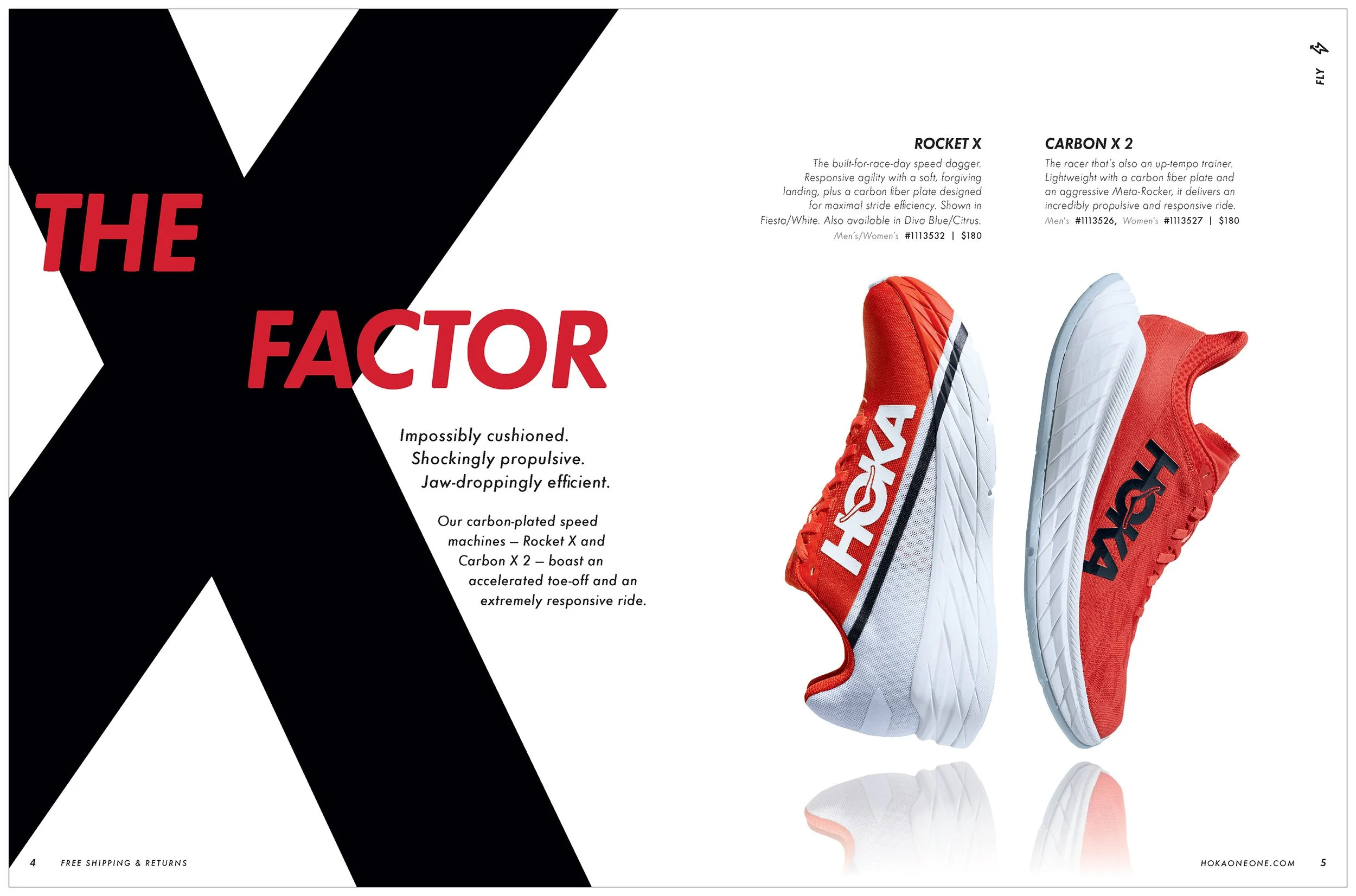
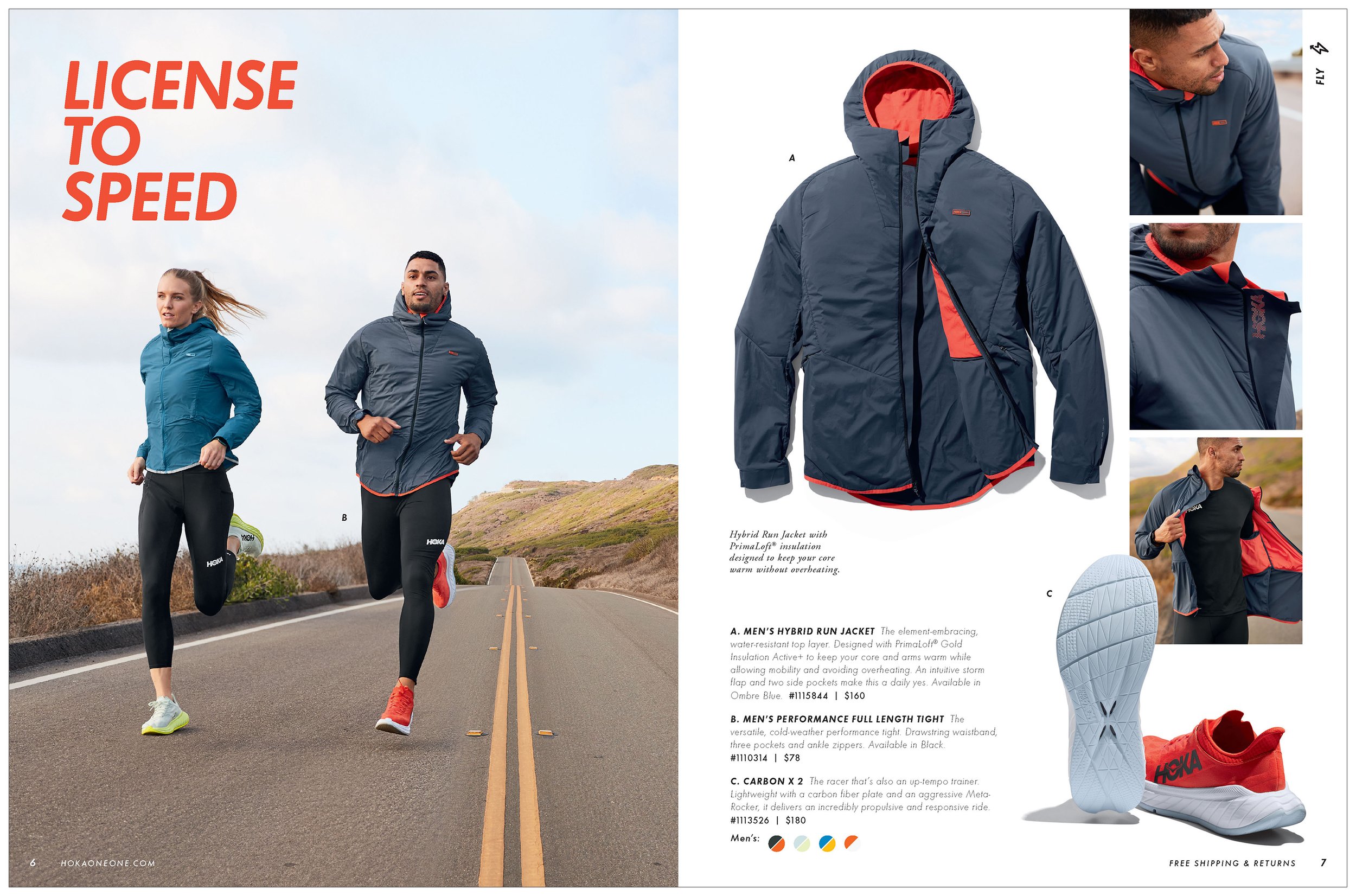
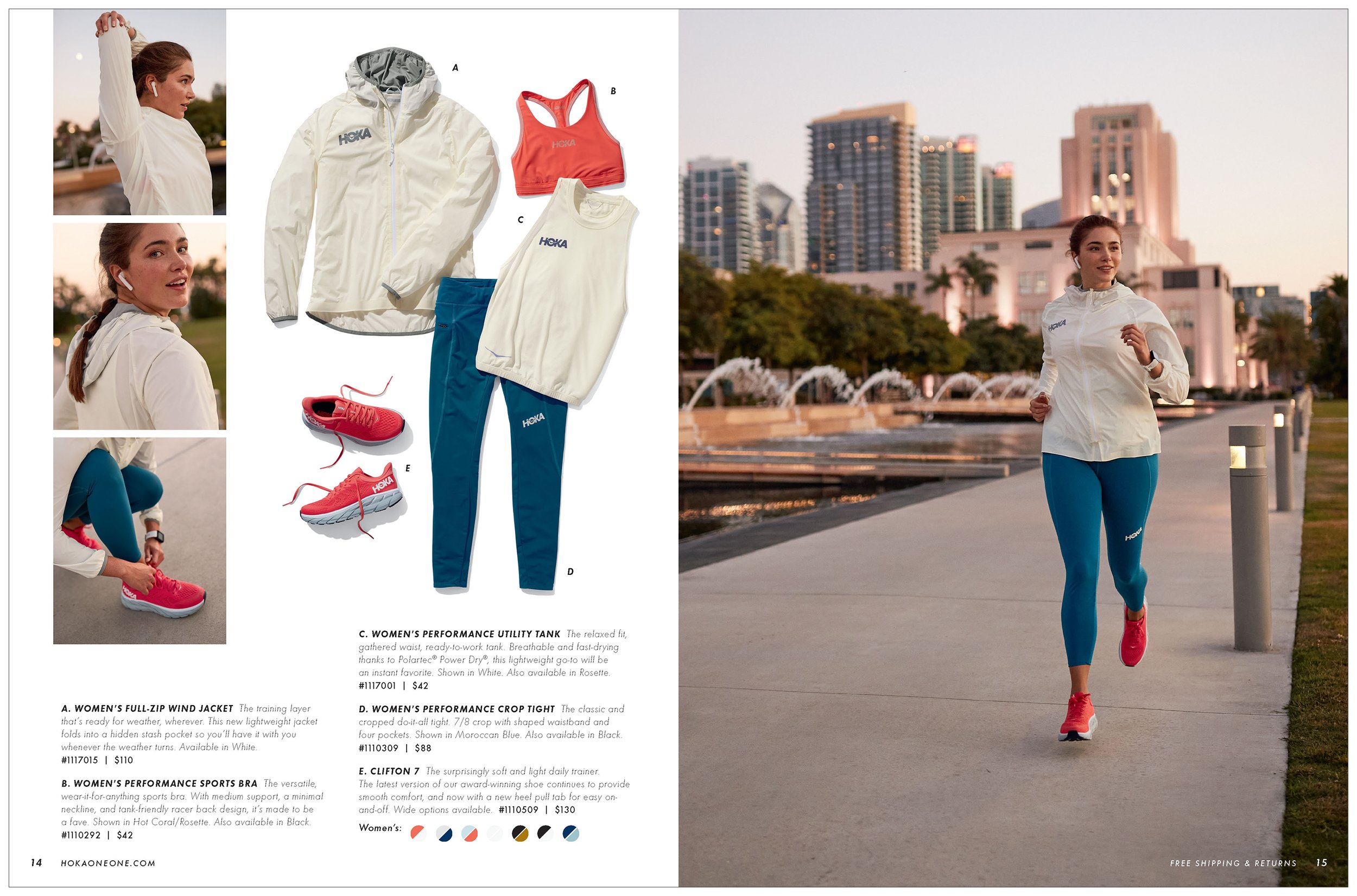
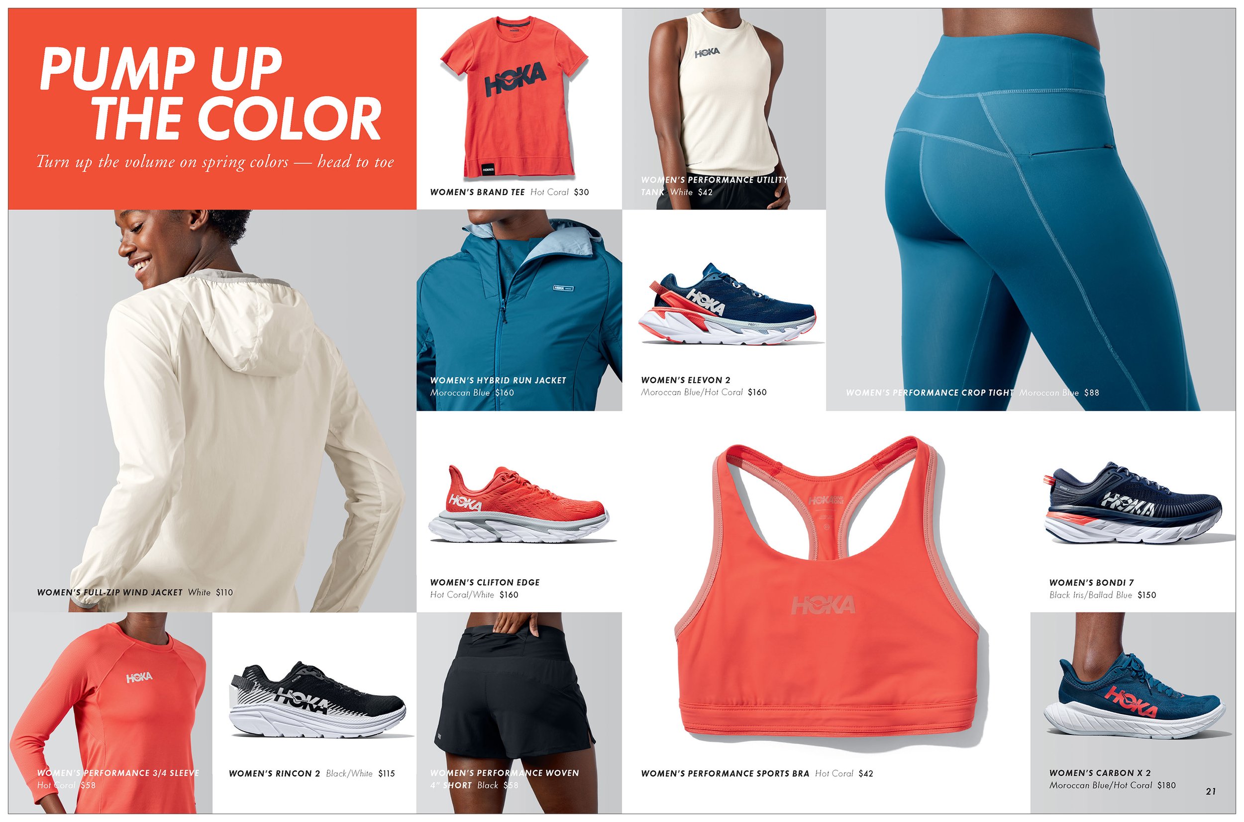
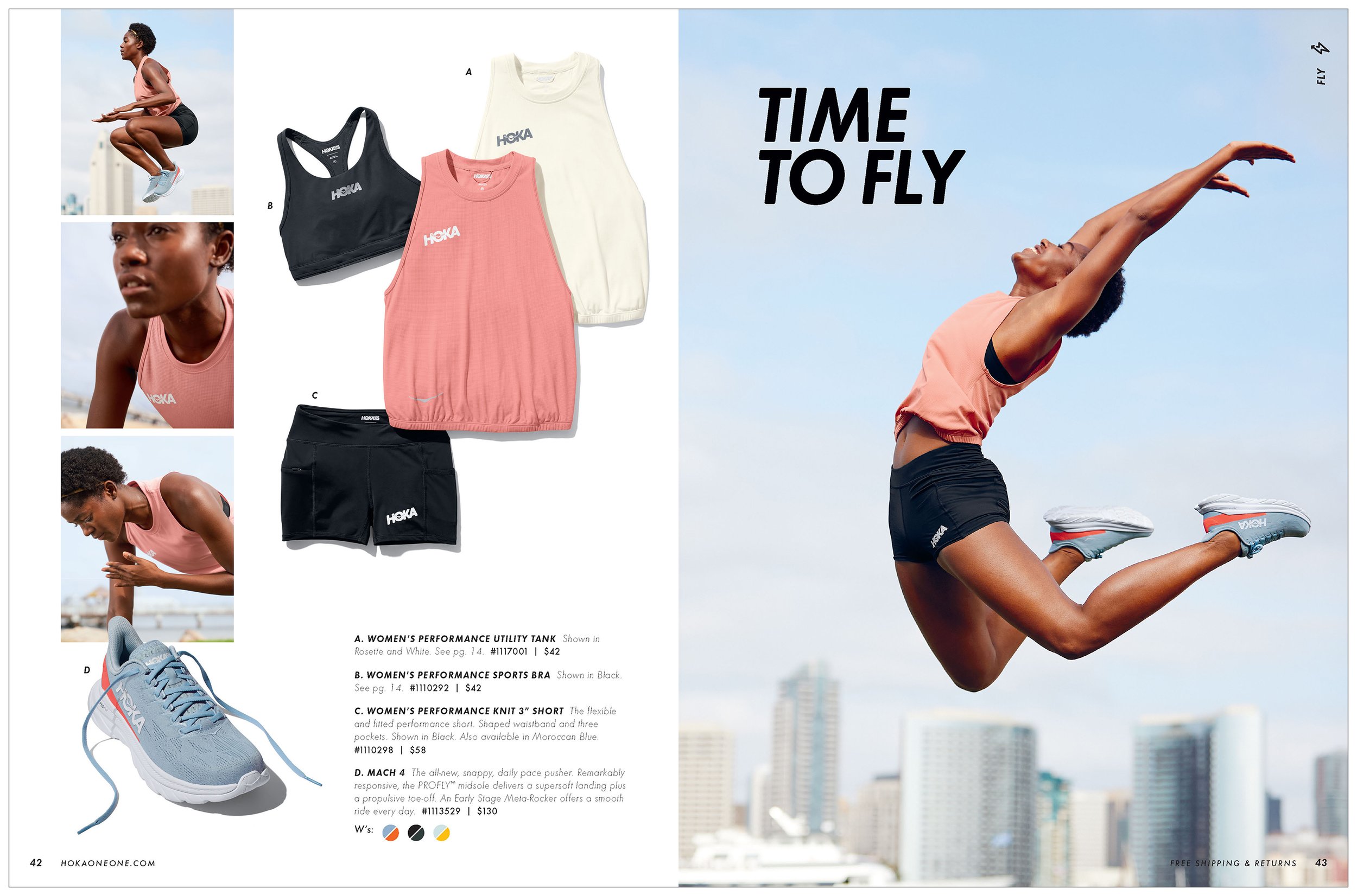
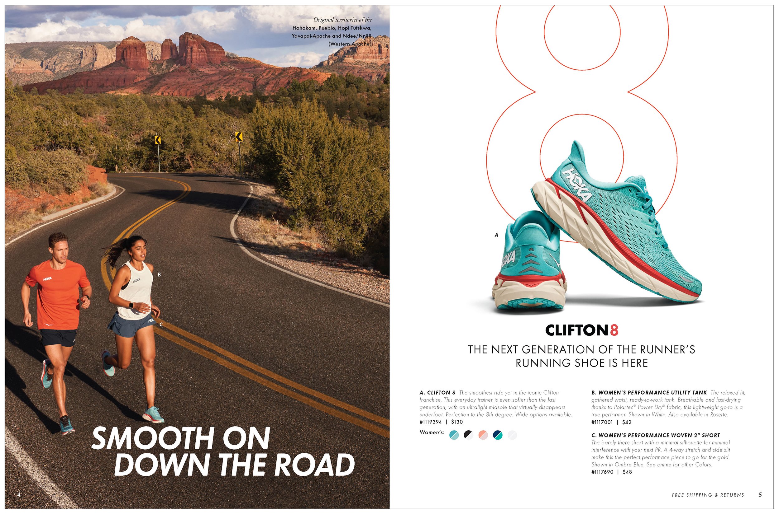
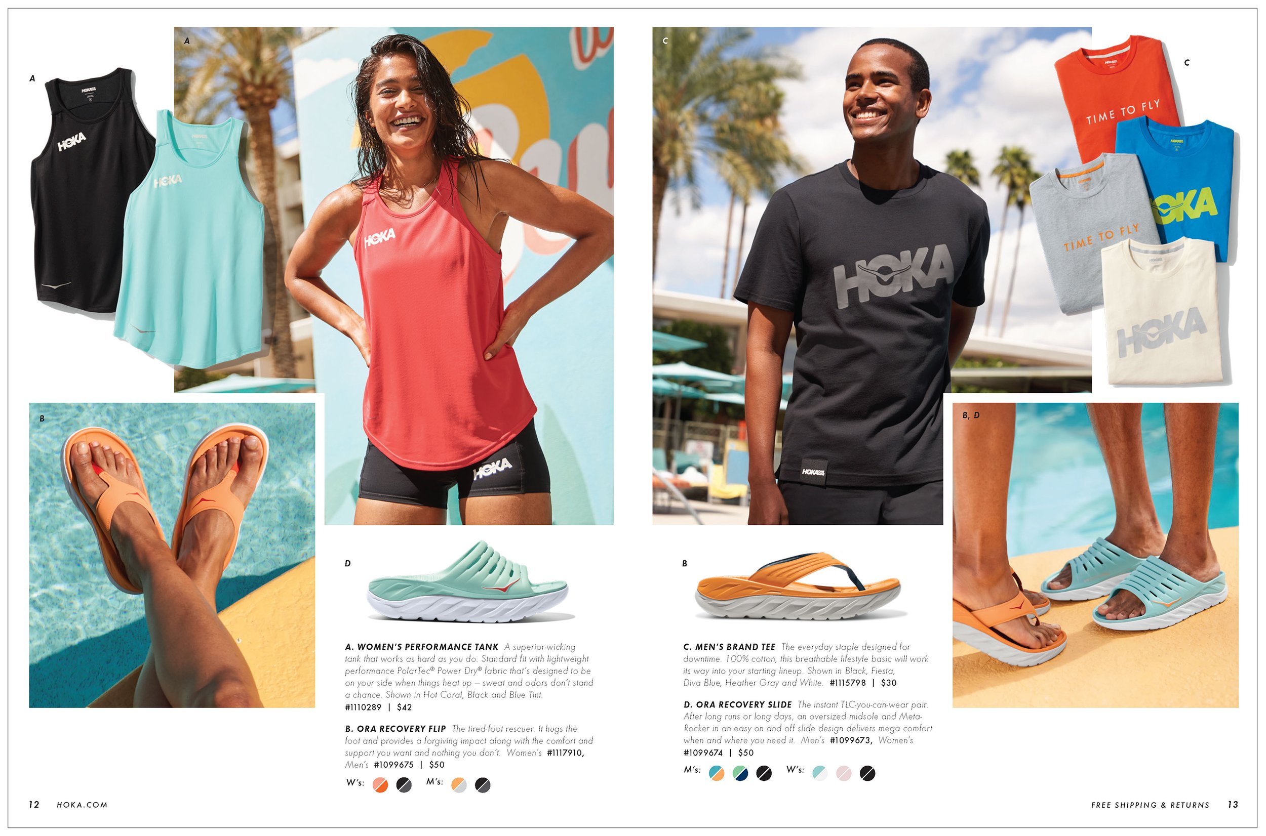
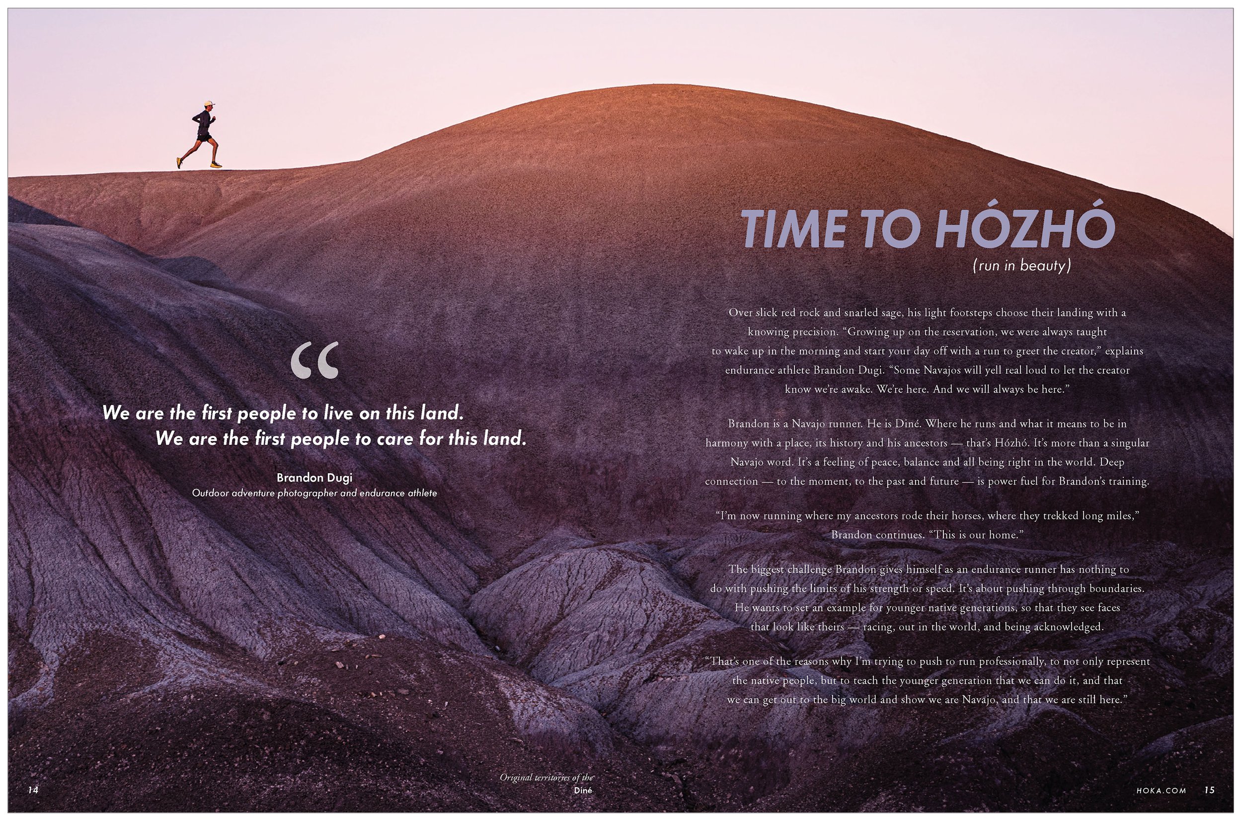
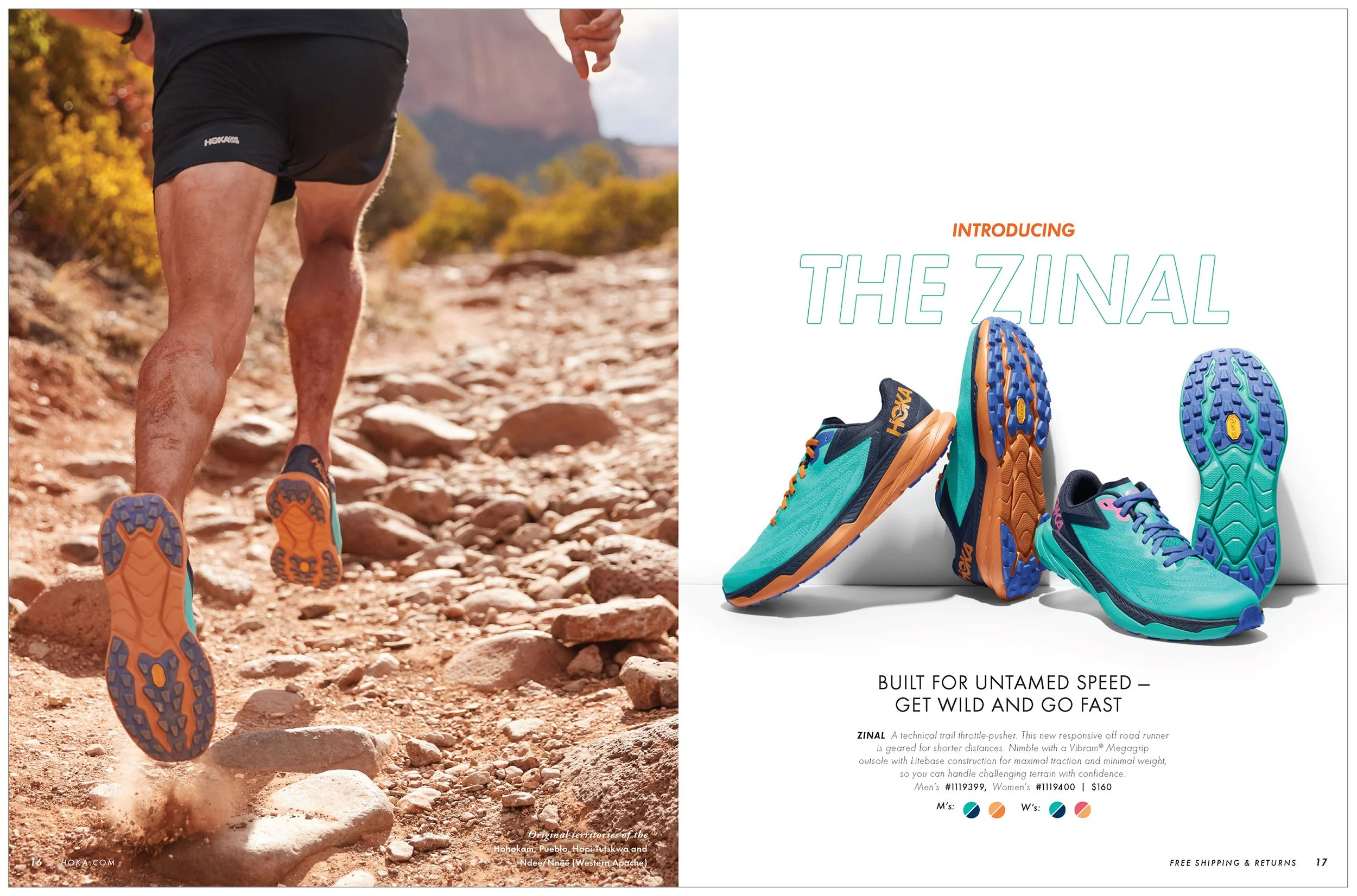
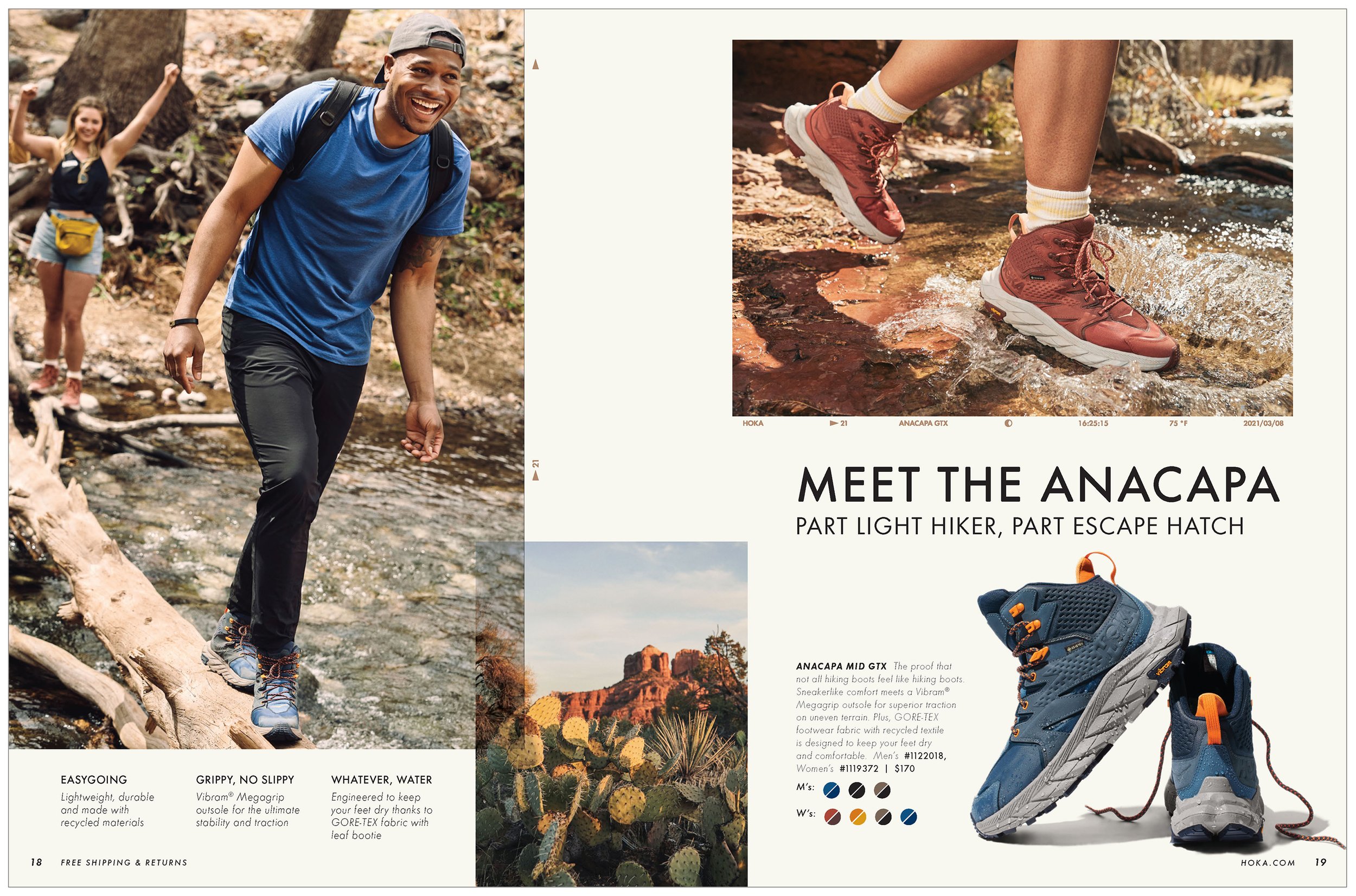
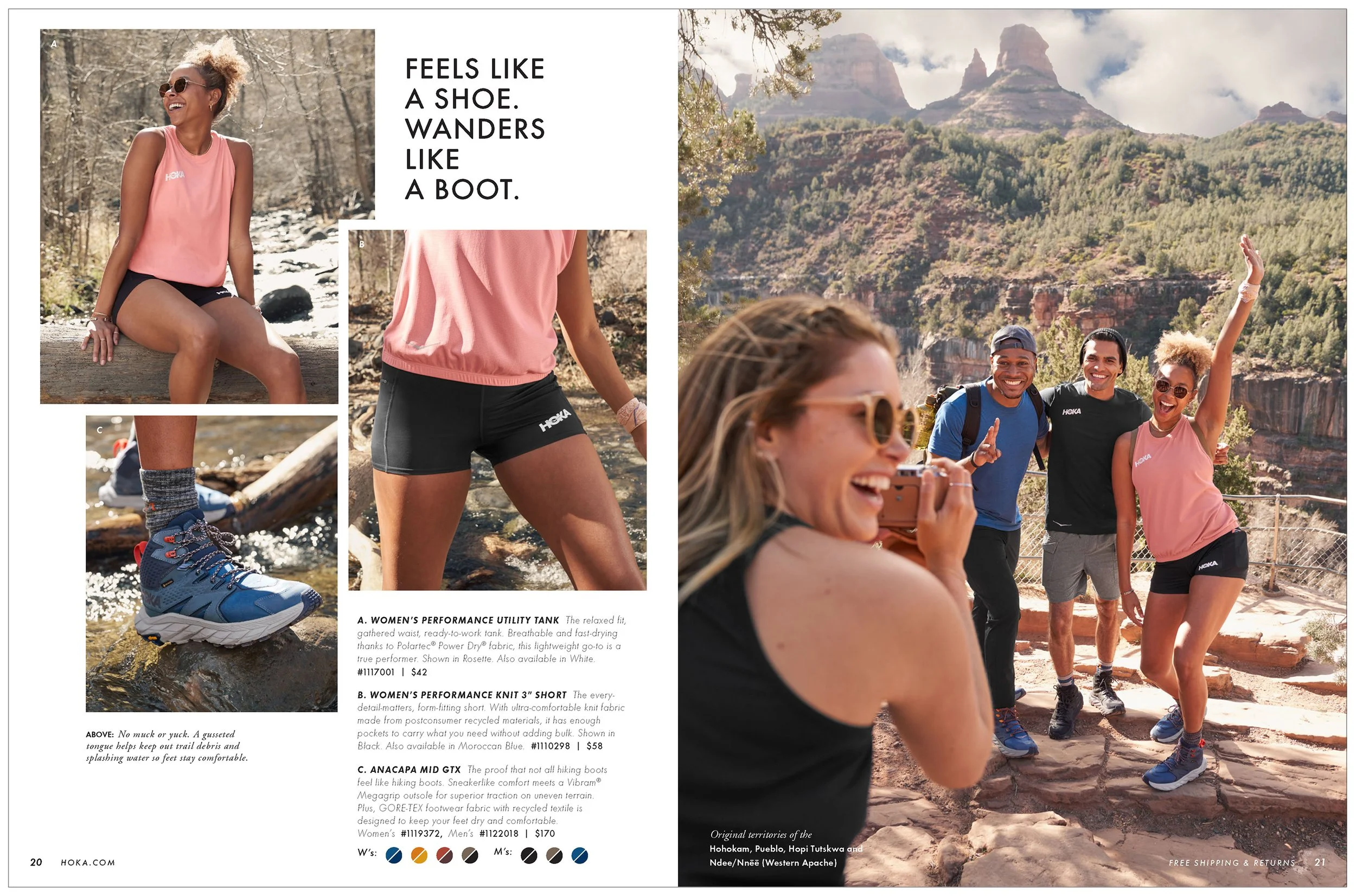
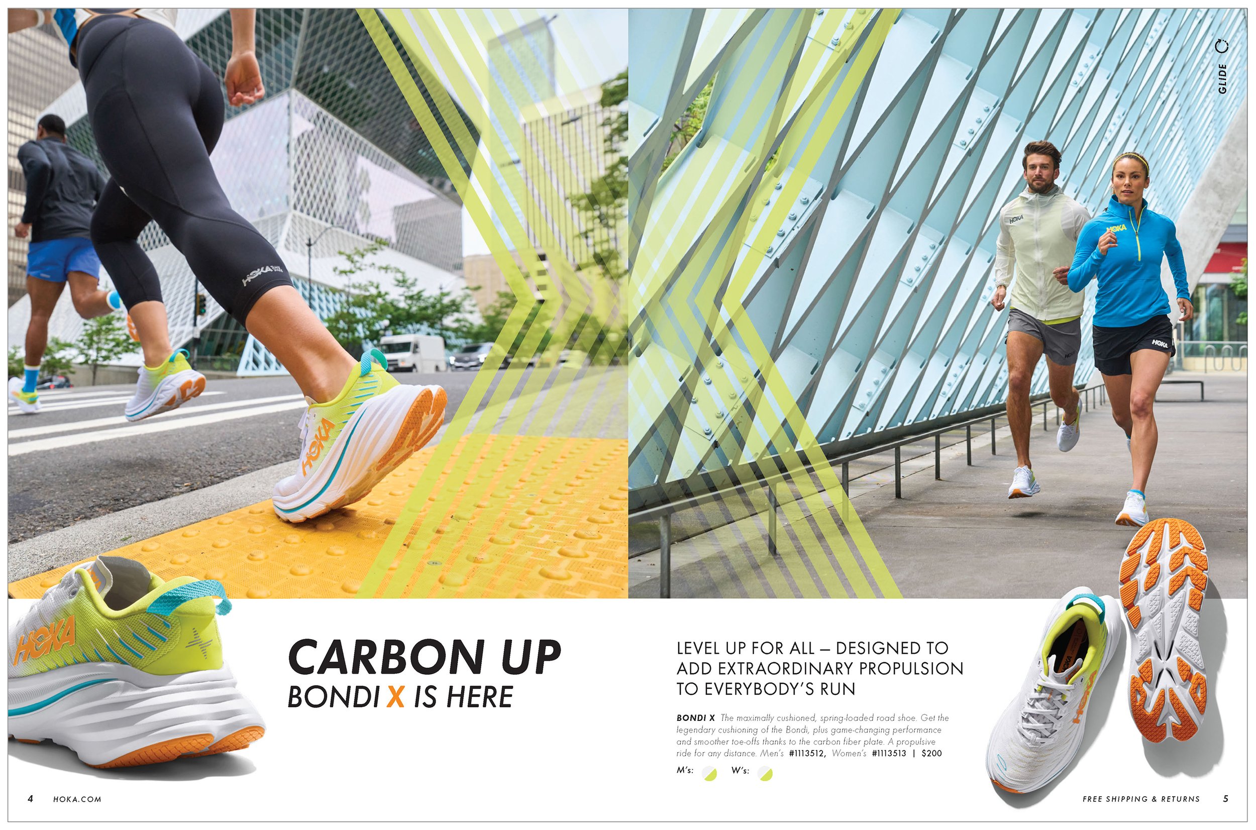
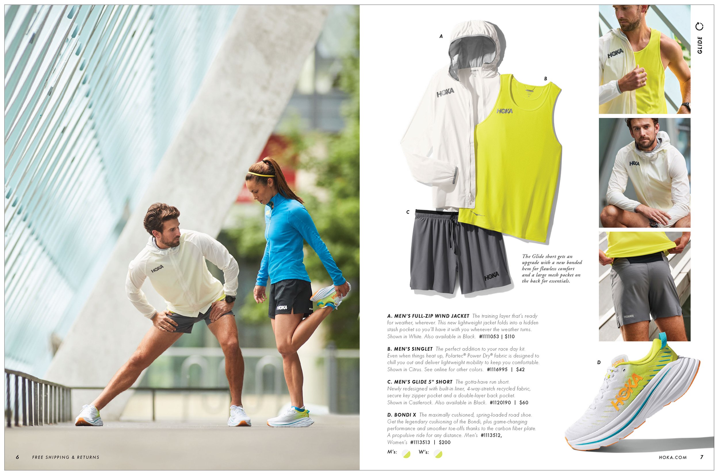
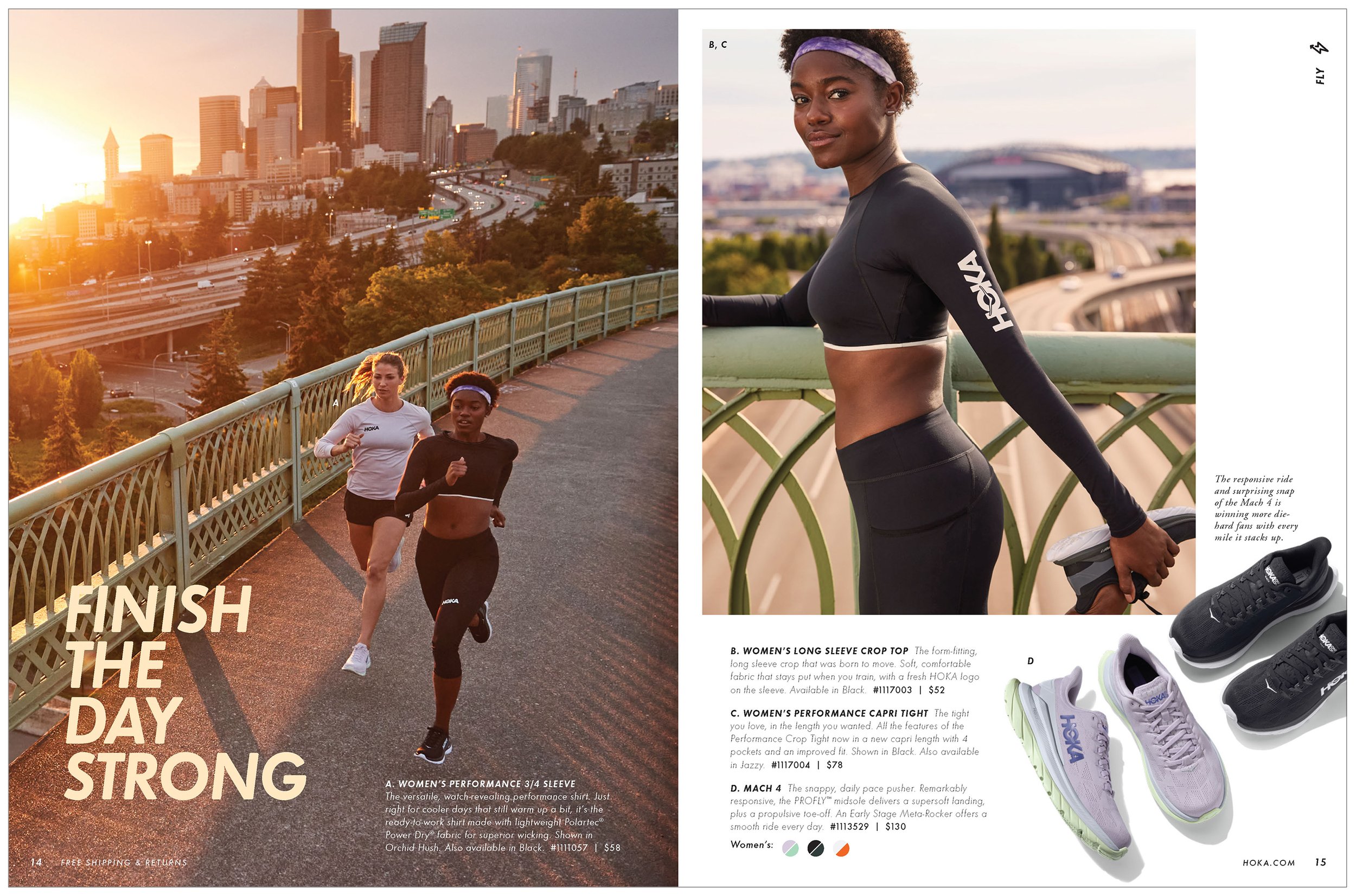
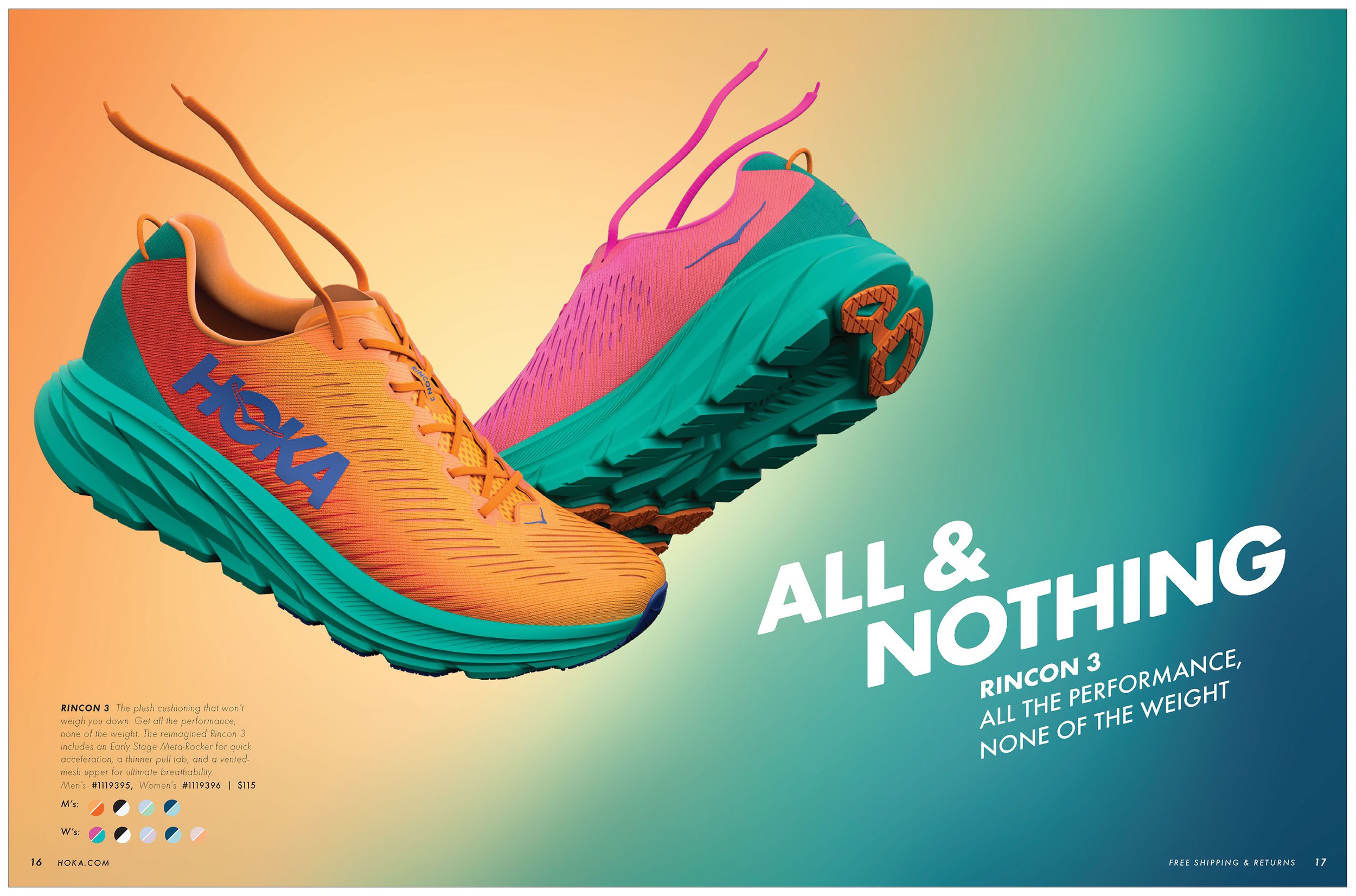
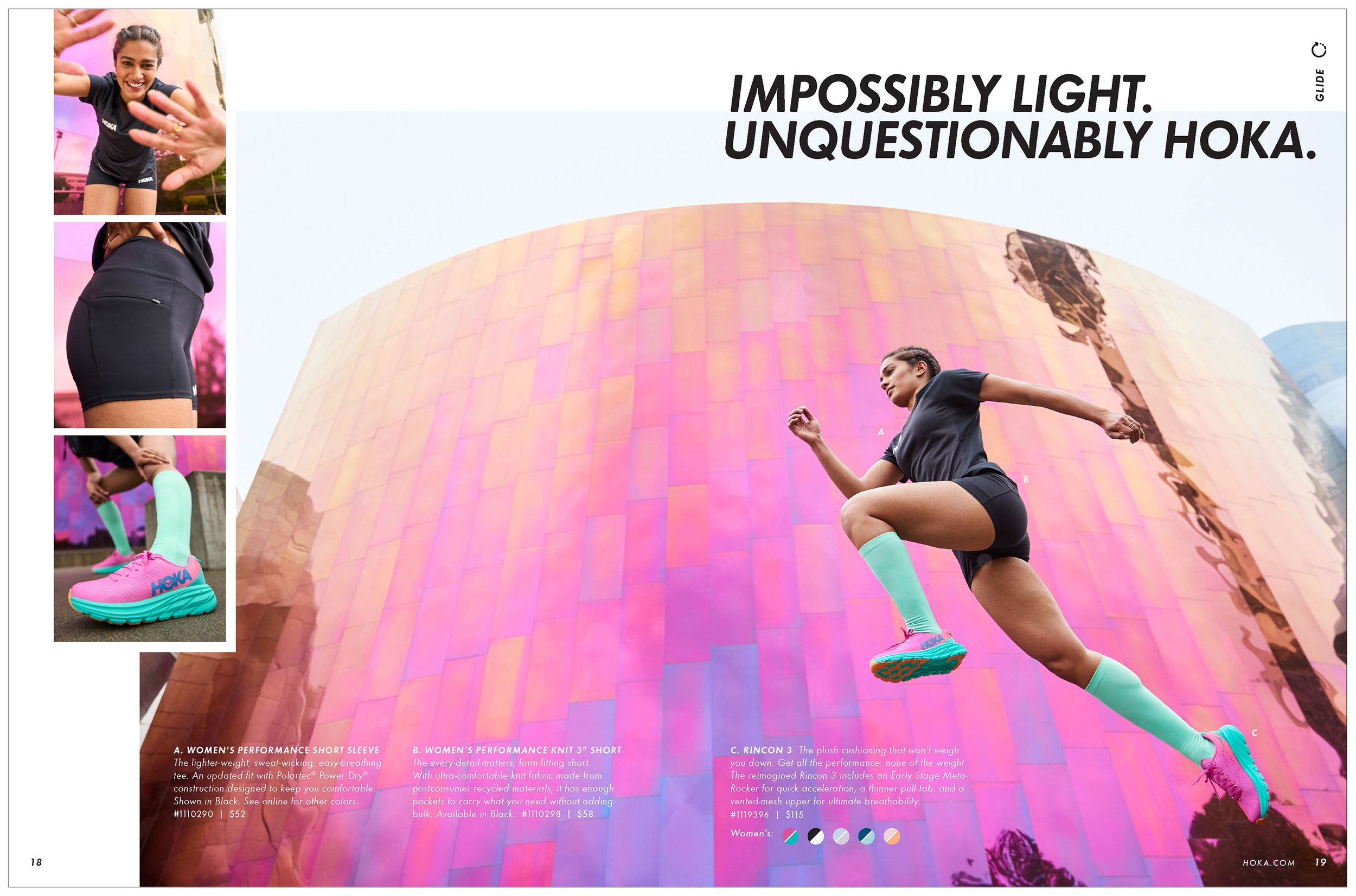
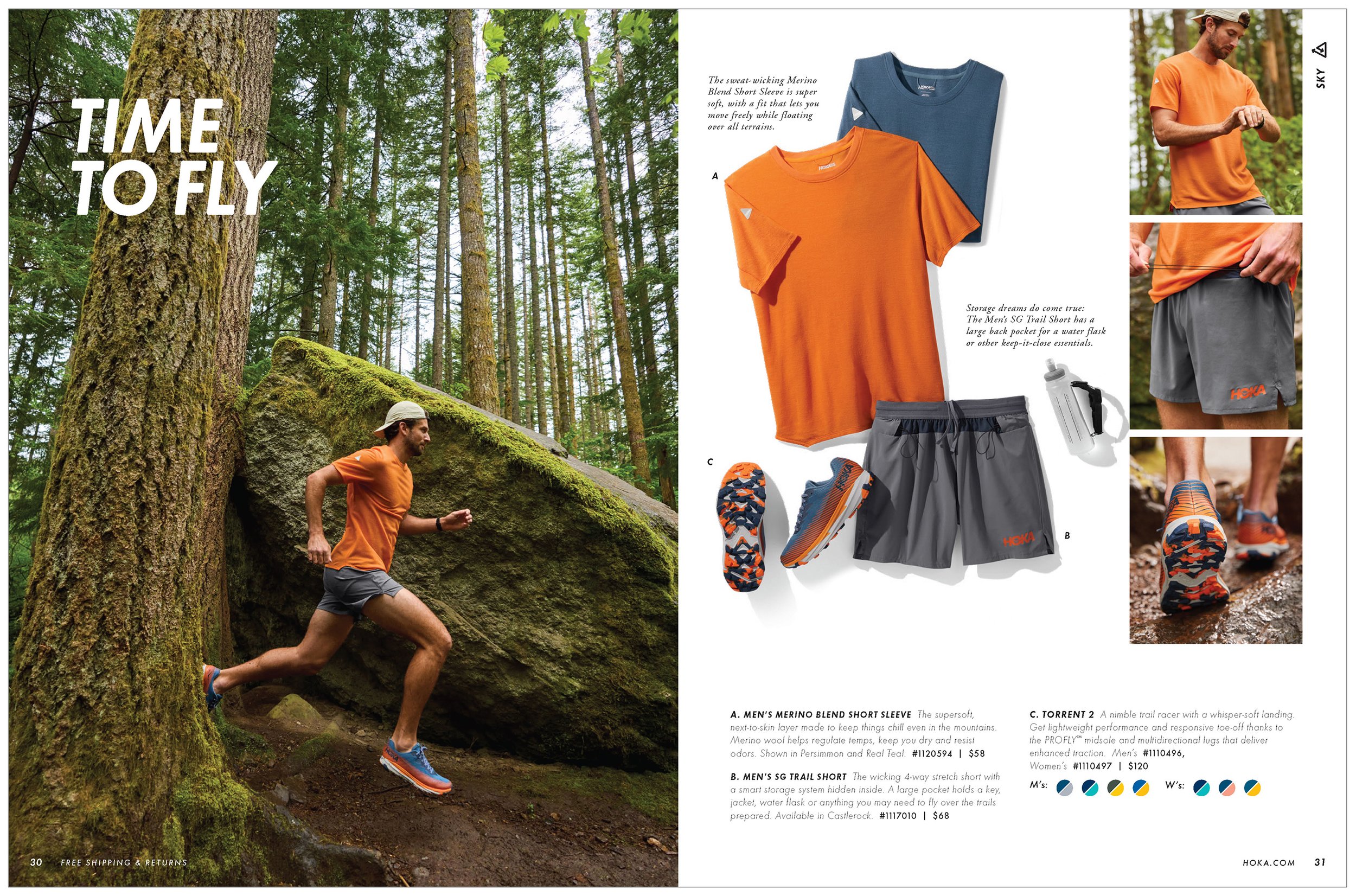
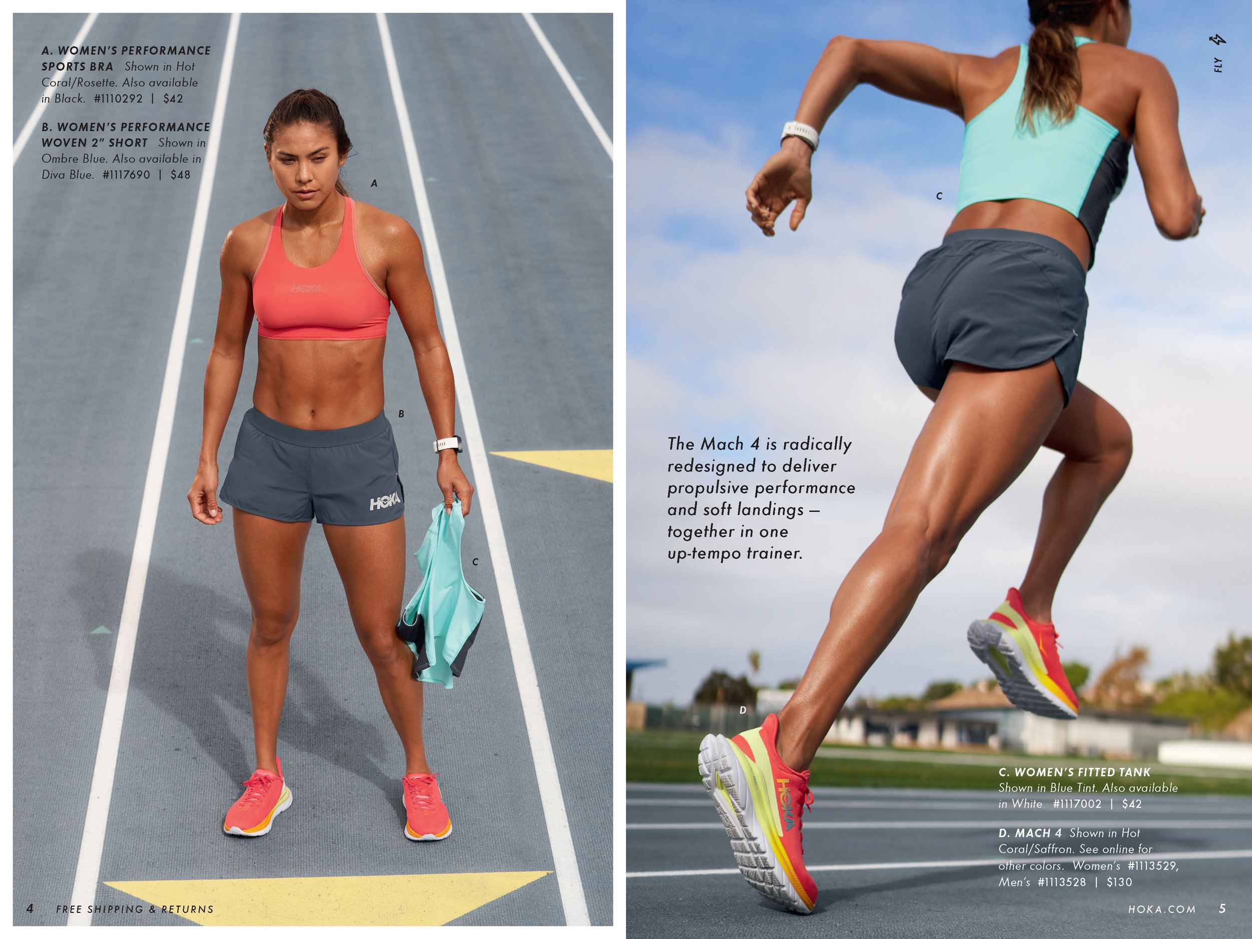
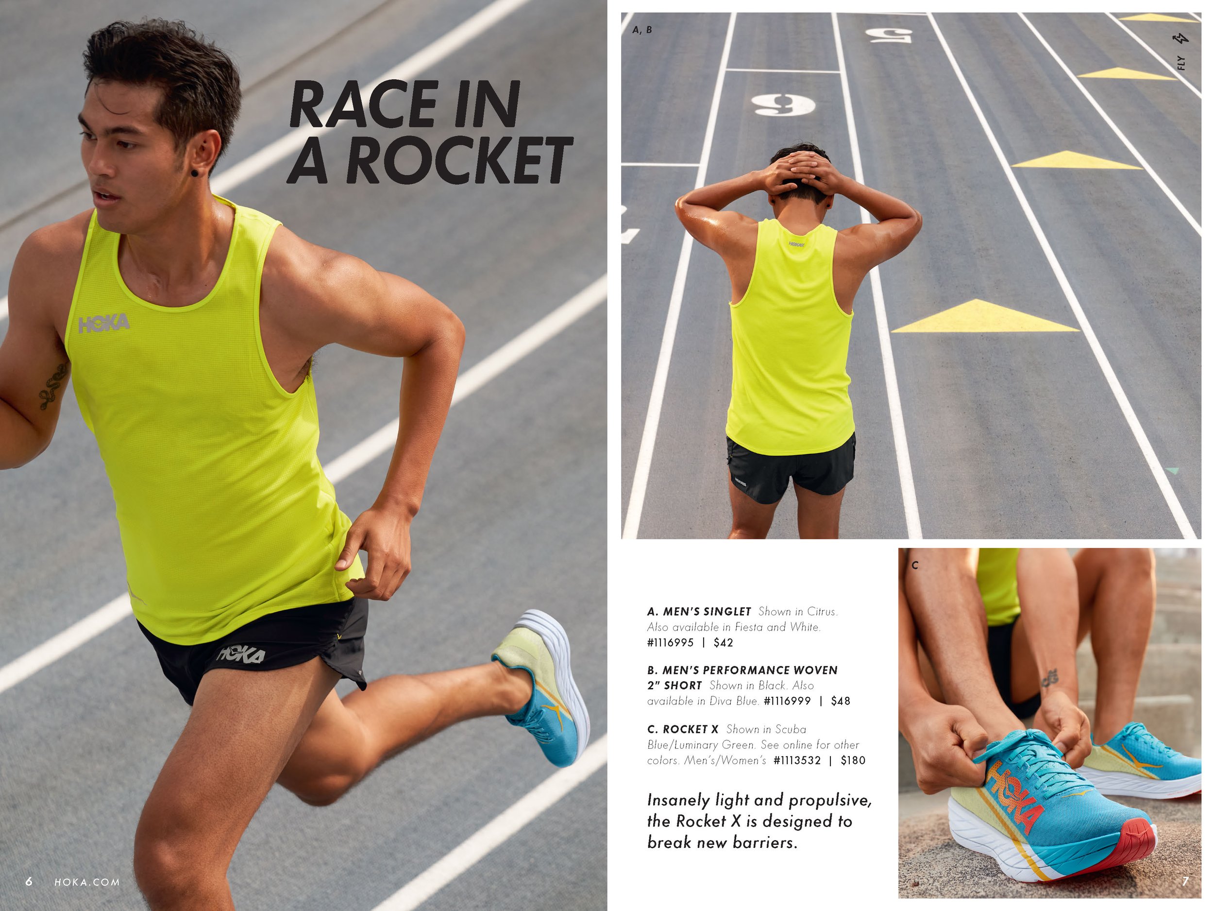
I was truly grateful when HOKA entrusted me to design their first consumer catalog. It was my initial intro to the running brand and I was coming from shooting furniture and interior spaces (that don’t move) to capturing runners in their footwear and performance fabric. Luckily I love a new challenge! I was responsible for defining the creative vision and tone of voice, directing all photography, and helping plan the product merchandising and pagination. I also designed the layouts and typographic treatment.
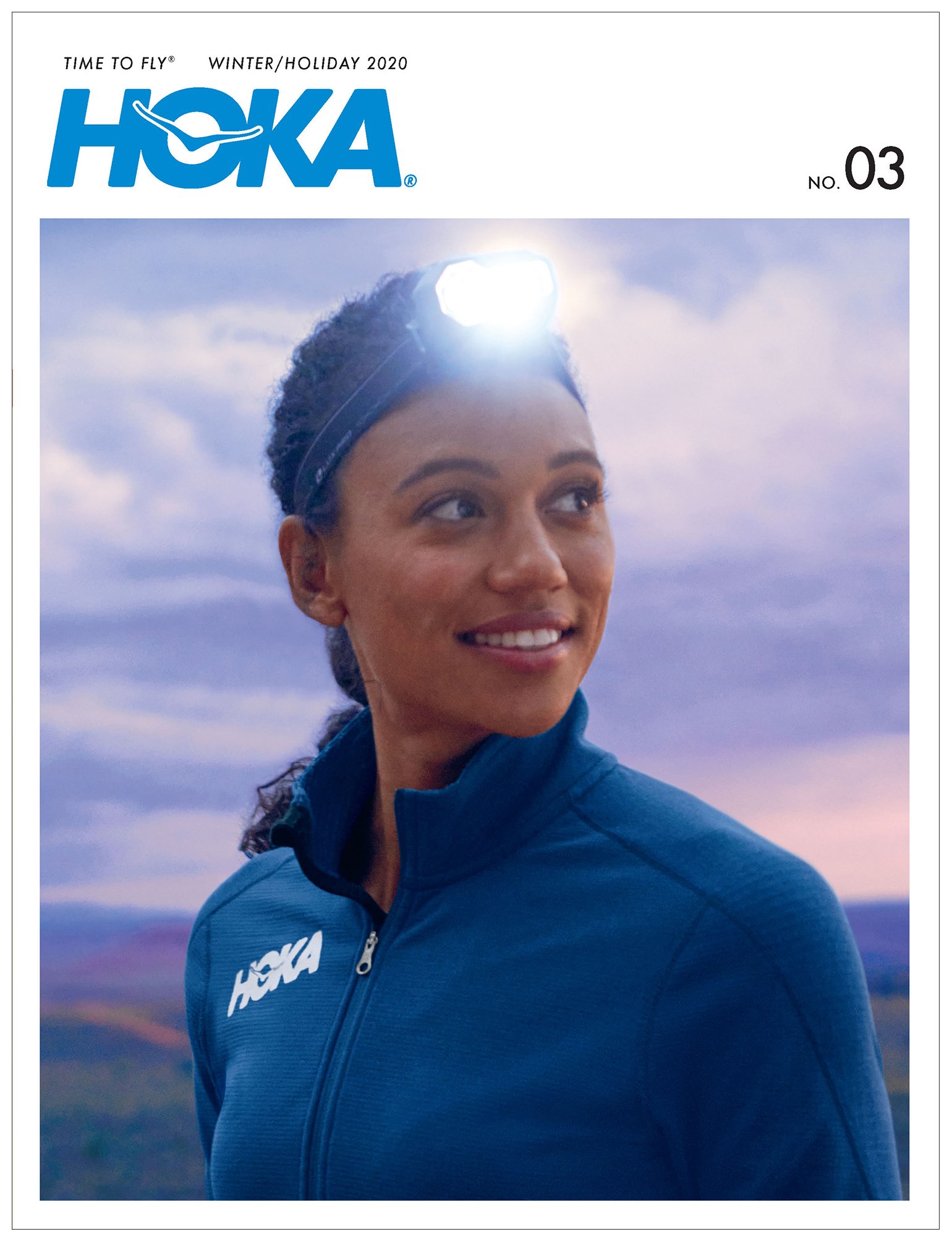
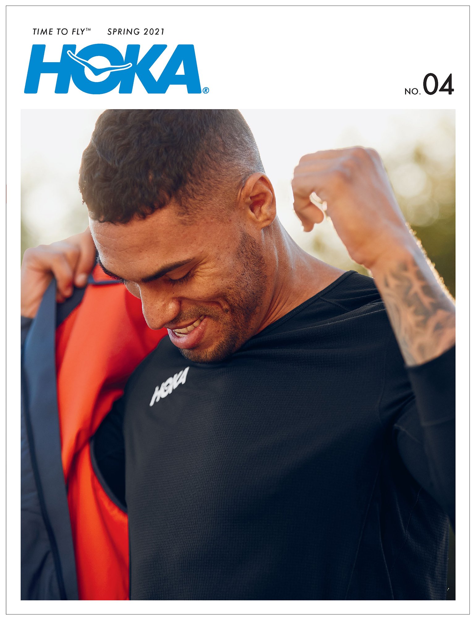
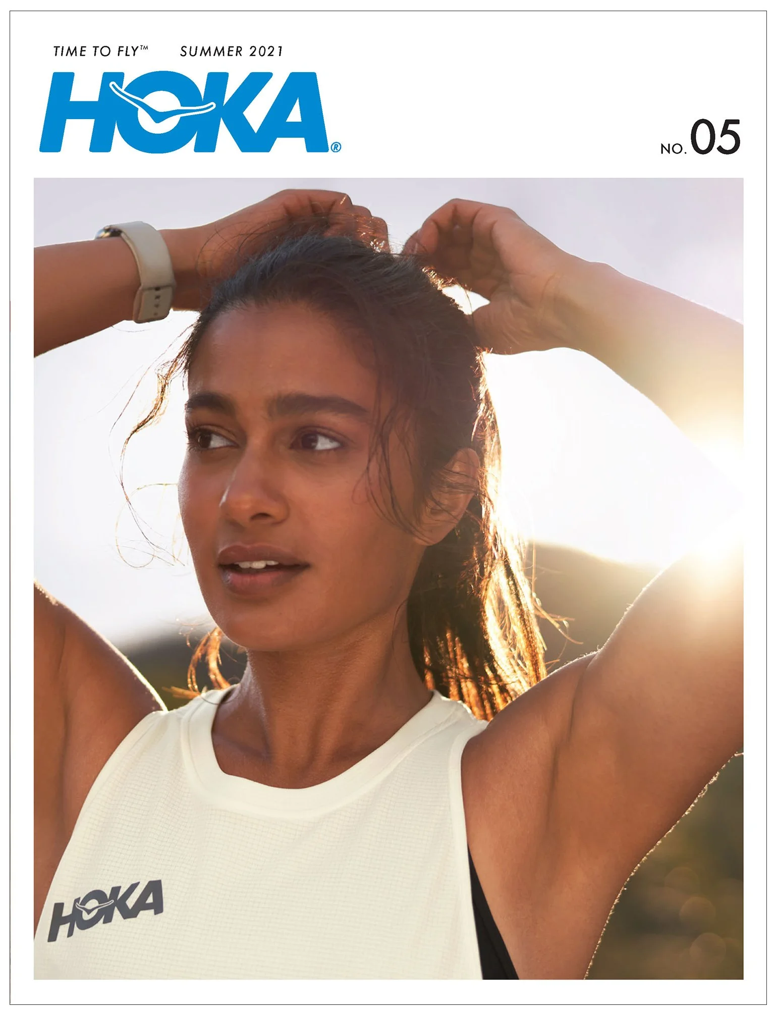
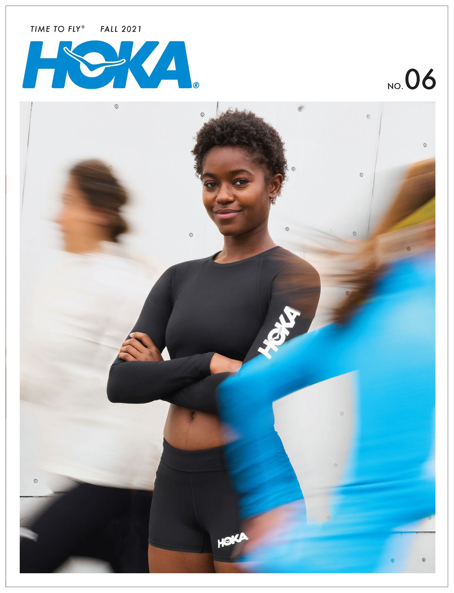
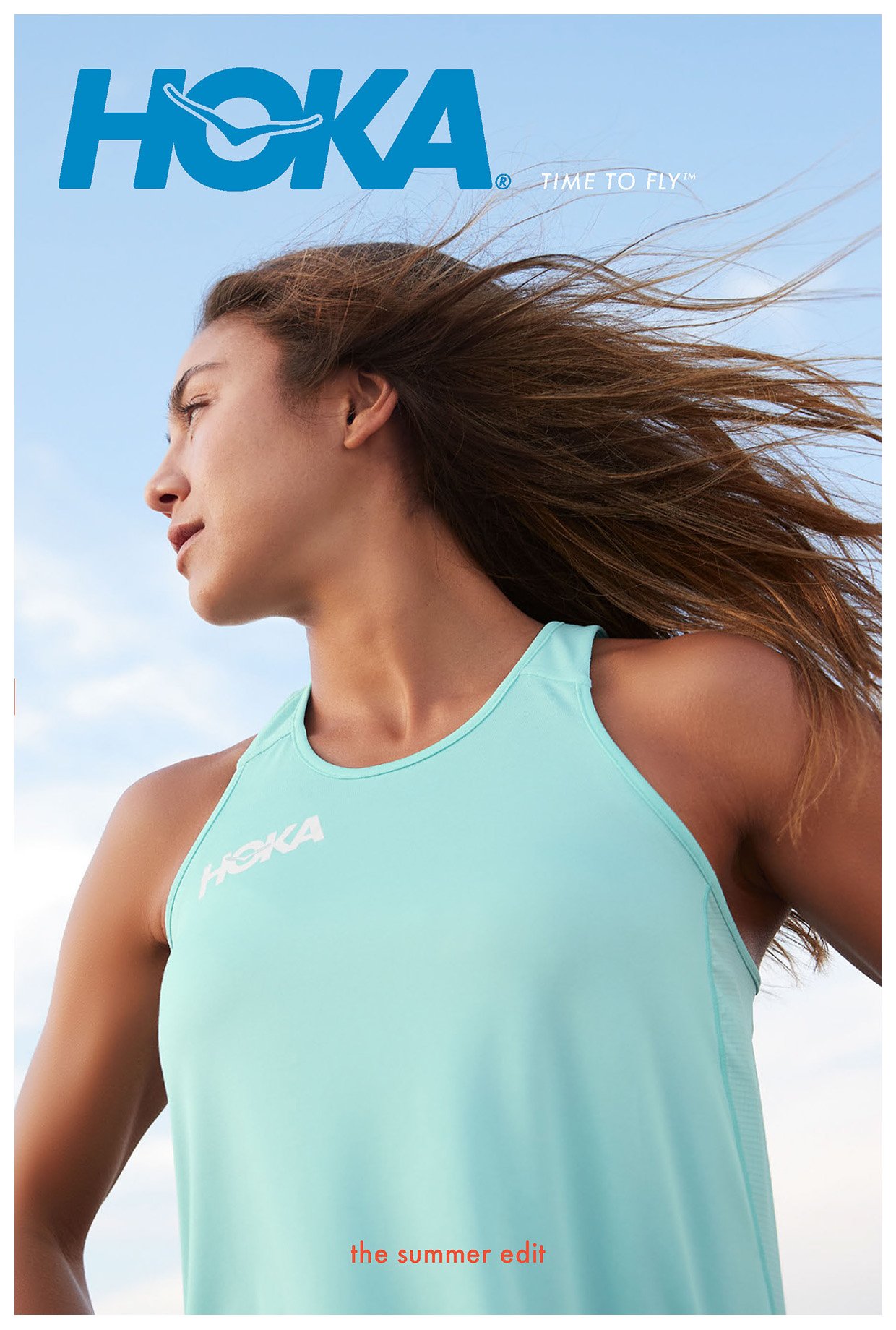
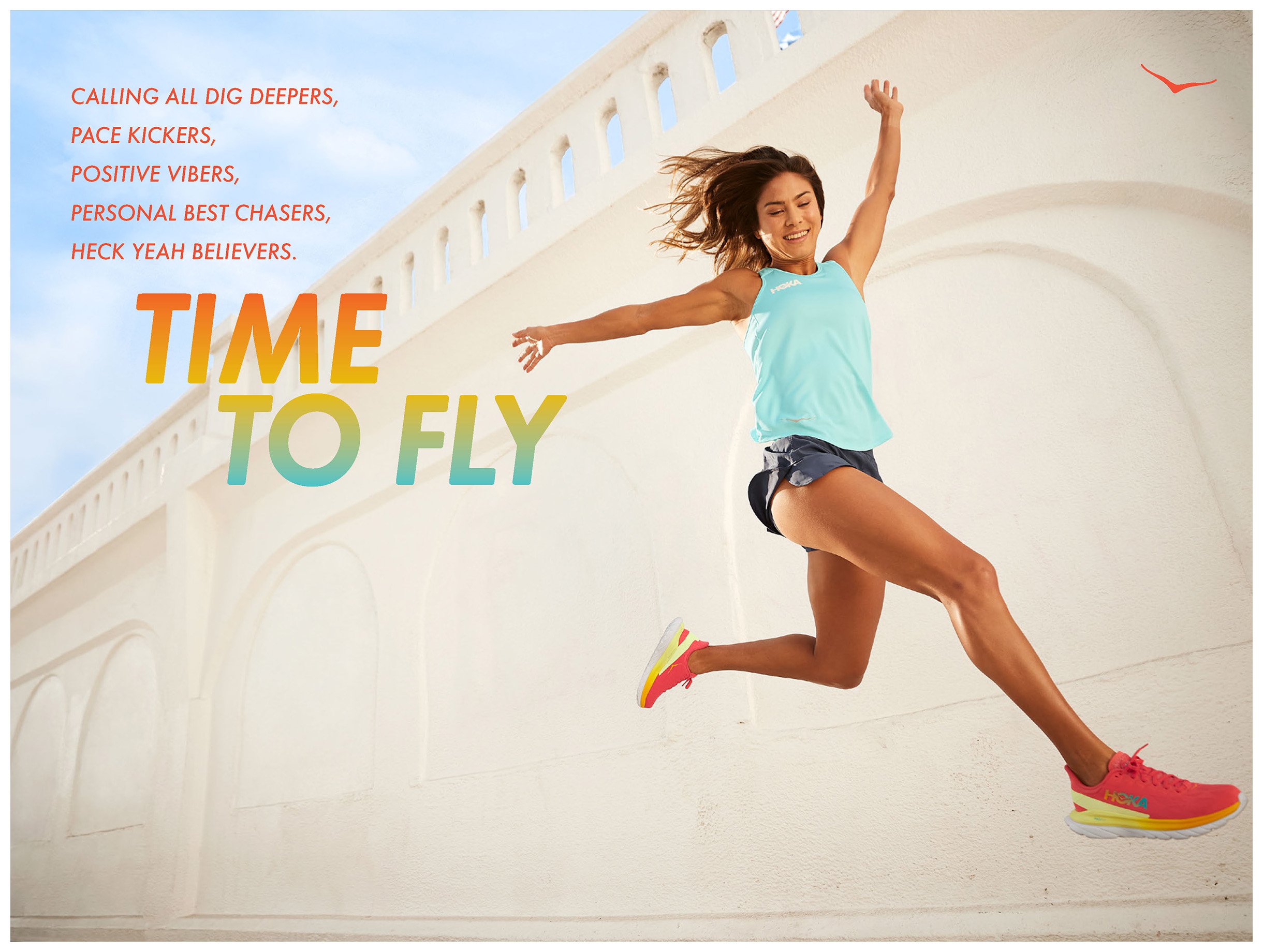
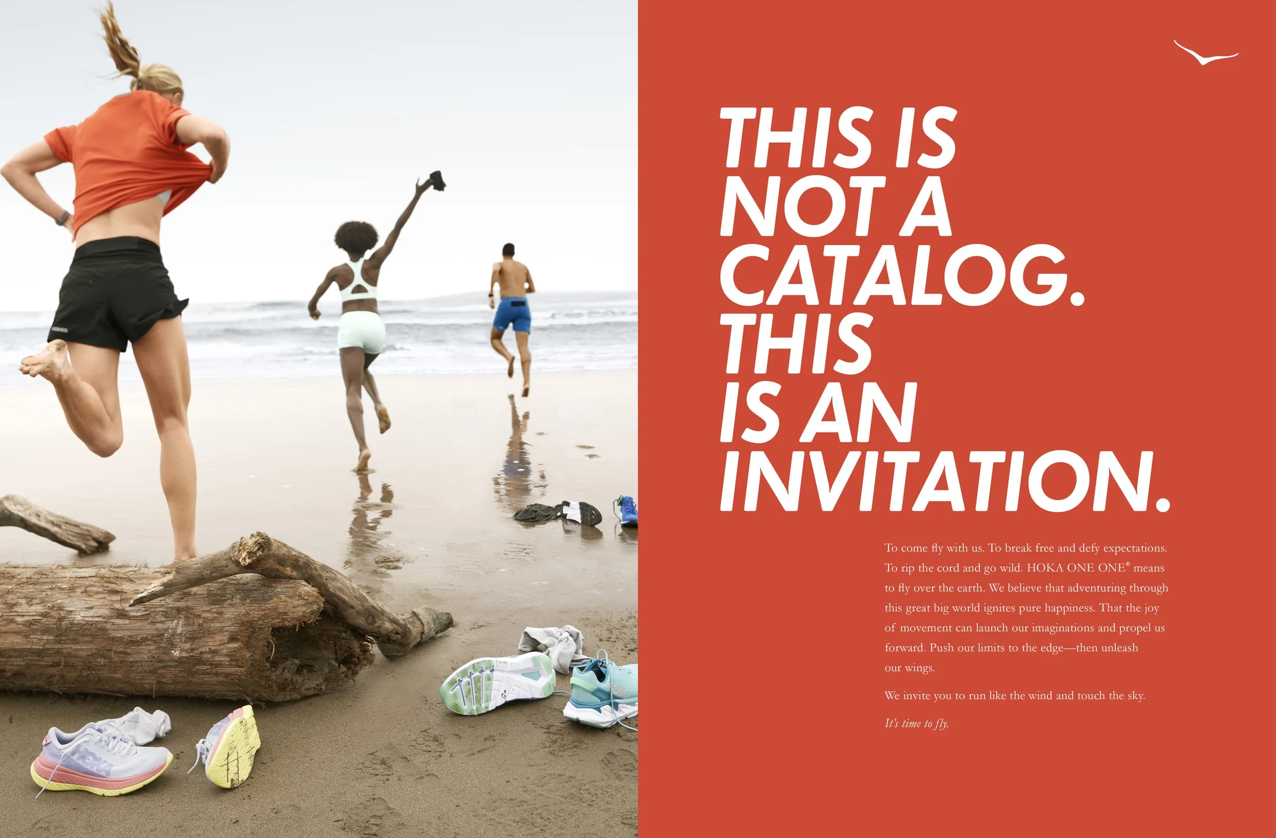
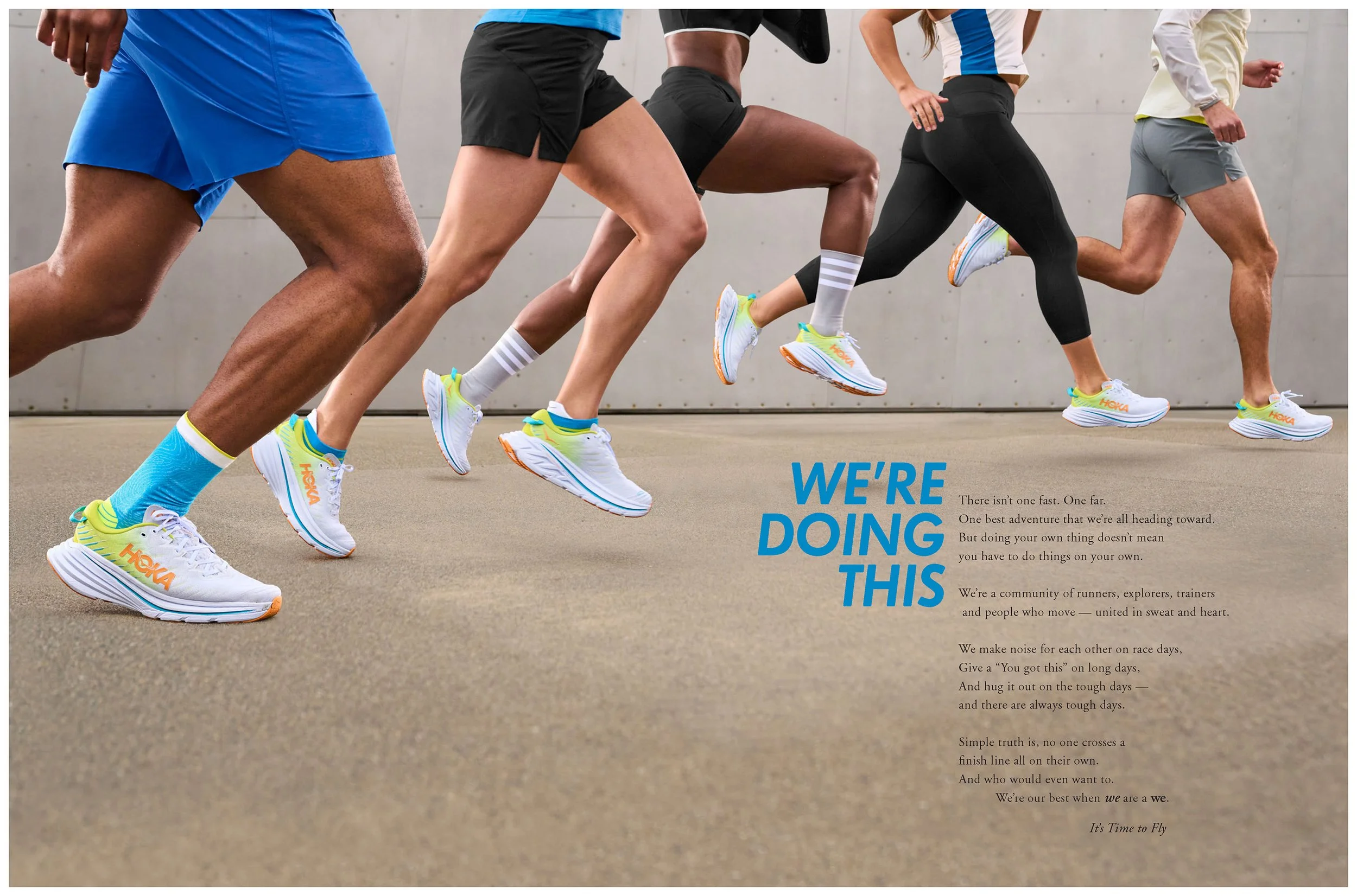
For HOKA, a brand that celebrates the joy of movement, it seemed fitting to lead each season with emotion on our cover and pay off with motion inside. The covers captured joyous moments just before, after or in-between a run and then invited you to turn the page and continue the story inside. The opening message always spoke like a friend – in a familiar, optimistic and warm tone – encouraging us to pursue the limitless possibilities that exists in all of us. I still reread these openers from time to time as a little pick-me-up and they always succeed in making me feel a little stronger, more resilient, and wanting to get outside and fly…
Examples of seasonal openers with brand messaging

